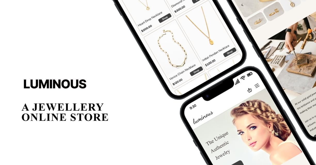
Luminous Jewelry is a small, driven jewelry business that works with talented designers to create unique and beautiful pieces. To help more people recognize their brand and boost sales, Luminous Jewelry decided to create a user-friendly website and app that would show off their designs and make shopping easy for customers.

Duration
8 Weeks
Business Needs
Boost Brand Recognition
Increase Sales
Build Brand Loyalty
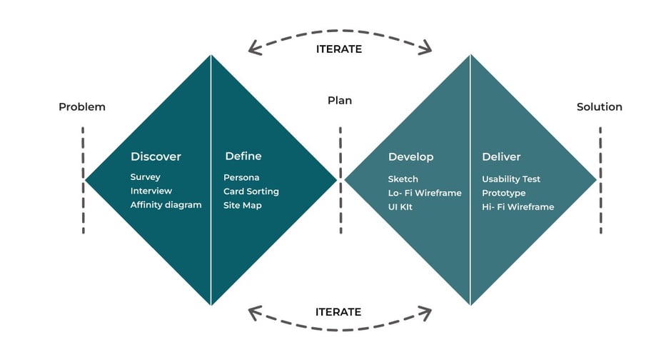
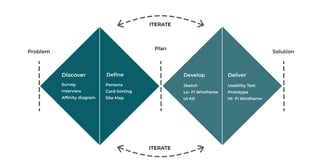
Discover
Survey
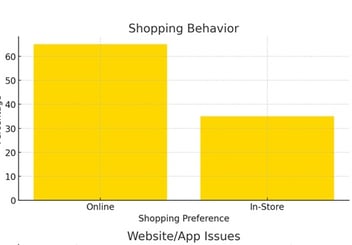
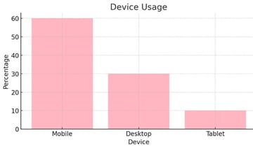
According to our survey :
Most of our users are between the ages of 20 and 40.
Online shopping is a popular activity among our users.
Most of our users use mobile devices.
Interview
Through interviews with potential users, key findings included a strong preference for a simple, straightforward design and clear navigation. Users wanted an intuitive shopping experience without unnecessary complexities.
Detailed Product Information:
Secure Transactions:
Custom Order Communication
Customer Support
Return and Exchange Policies
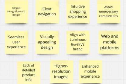
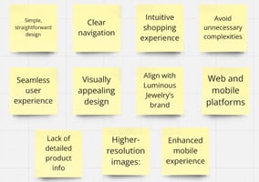
Affinity Diagram
Improve the shopping experience, especially payment and cart processes.
Enhance product details and image quality.
Address site navigation and category access.
Better visibility of discounts and offers.
Take out:
Simplify payment and improve shopping cart clarity.
Enhance image resolution and add detailed gemstone information.
Improve category navigation with advanced filters.
Highlight discounts prominently on the homepage
User Needs
Easy to Use
Simple Shopping
Inspiration and Customization
Card Sorting
We completed the initial classification using a hybrid card sorting system among 13 people.
Define
Sketch
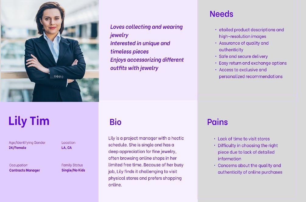
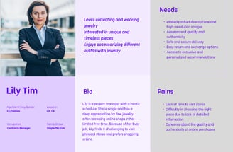
As a result of the research, our team created a persona to represent our target users and their needs.
Develop
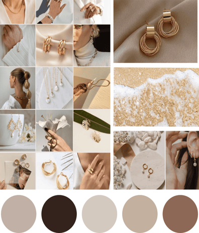
Mood Board
A mood board was developed that contained all the images and colors that
inspired us to find how the website should appear to users.
Design
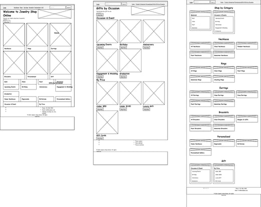
Shop
Filter & sort
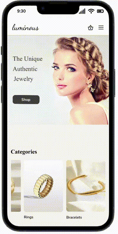
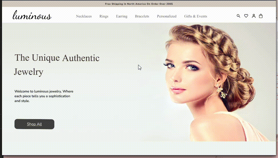
Home
Product

Iterations on "Home Page"
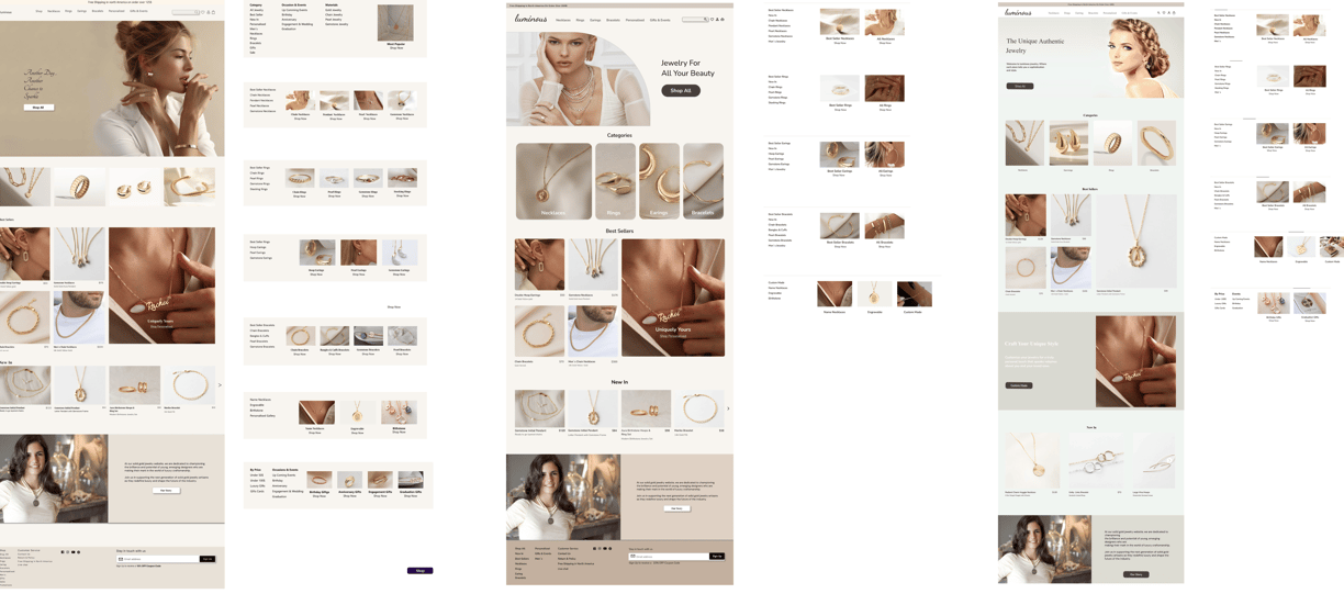
Deliver
Final Prototype
In this section, you can check out the final prototypes.
Reflection
REFLECTION
What did I learn?
My first case study project exposed me to the importance of understanding users' needs at every stage of the design process.
The best way to gain this overview is by keeping track of all research findings and referring to them continually.
My favorite aspect of the project was interaction design, and I will continue developing this skill in the future.
What can we do next?
It would be nice if I had more time to improve the accessibility of the pages so that they are more useful to any user.
Reflection
Role
UX/UI Designer
Team
Group of 3
Tools
Figma, Photoshop, Zoom, Google Form
Our Approach
Design for the User
Smooth Shopping
Keep Customers Engaged
Persona
As a result of the research, our team created a persona to represent our target users and their needs.
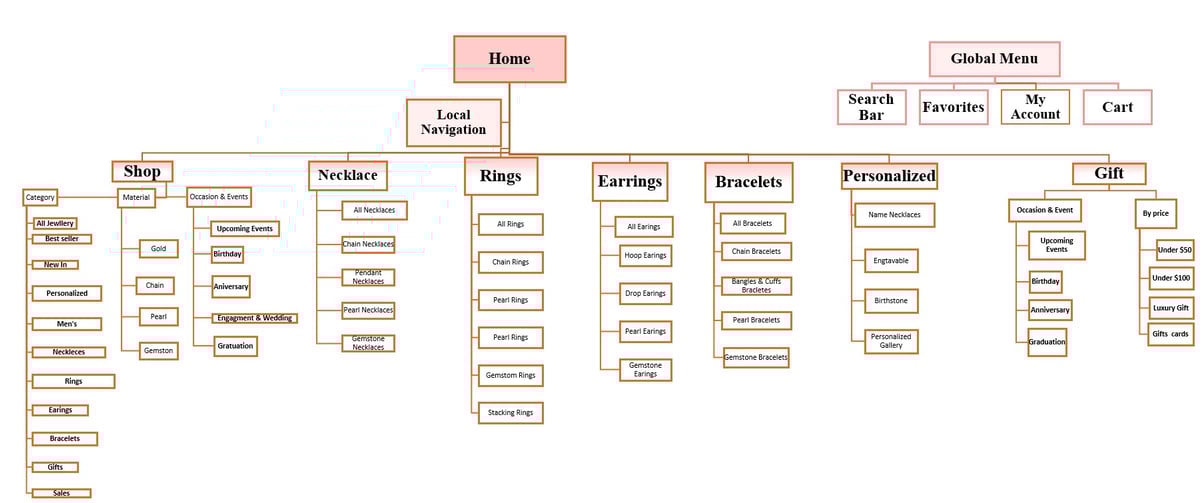
Site Map
Our next step, based on the data we collected, We decide where the main categories would be located on the website and how they would relate.
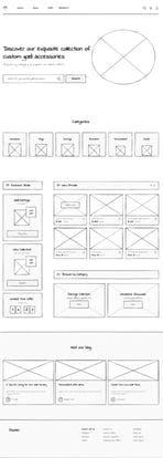
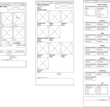
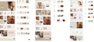
First Iteration (Left-most Design):
Header: Designed to be simple, featuring minimal navigation and search options.
Hero Section: Uses a large model image to create impact, paired with a clear call-to-action.
Product Display: Prioritizes best sellers and new arrivals for easy user access.
Footer: Includes essential links, social media icons, and a newsletter sign-up for user engagement.
Second Iteration (Middle Design):
Header: Slightly more complex, offering additional navigation options for broader exploration.
Hero Section: Maintains a similar layout with slight adjustments to imagery.
Product Display: Refined categorization for smoother navigation and improved user experience.
Footer: Similar structure to the first iteration, with possible enhancements like added contact details.
Third Iteration (Right-most Design):
Header: Further simplified to streamline user interaction and reduce visual clutter.
Hero Section: Similar approach with subtle refinements to enhance visual appeal.
Product Display: Emphasizes categories and best sellers, with layout variations for testing.
Footer: Remains consistent with earlier designs, ensuring a user-friendly experience
User Experience Considerations
Iterative Changes: Subtle design adjustments are made based on feedback, aiming to improve navigation, product visibility, and overall user engagement.
Responsive Design: The designs are adaptable to different screen sizes, as indicated by the thumbnail previews.
Conclusion
These design iterations are part of a refinement process, aimed at balancing aesthetics, usability, and engagement. Each change is intentional and informed by data, enhancing the e-commerce jewelry website's overall effectiveness.
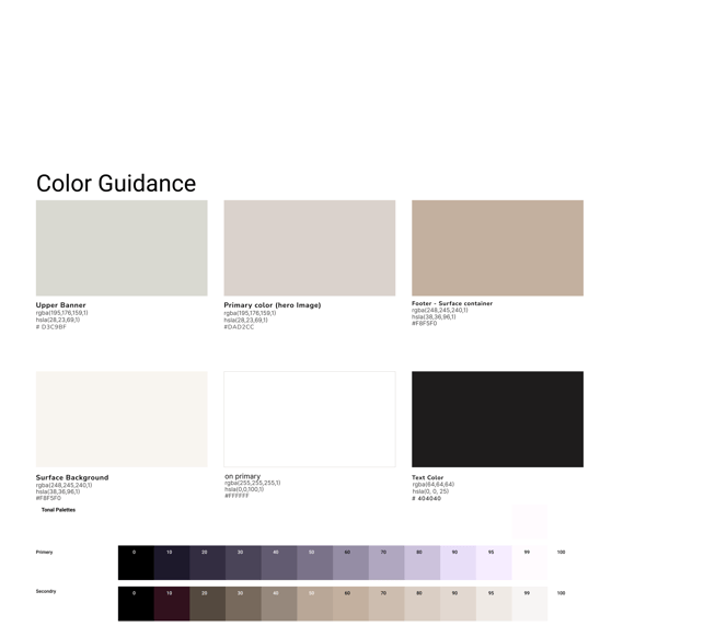
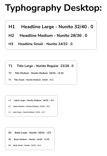
UI Kit